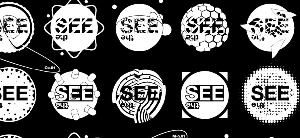

Logo for the self-initiated project The See
The essence of The See is that there are other ways to take in our surroundings than the ones our culture has formatted us to use. This thinking is the backbone in all our self-initiated projects and the idea of having a flexible logo has been sitting around for a couple of years - the right client or project for it just didn't materialize until work started on The See although we had used the thinking to some extent with the Læseheste og Hundehoveder logo which came in (just) four versions.
br>The logo has been formatted as a font system so it's fairly easy to build the 160 different versions that were designed over a weekend in february 2009 as an almost stream-of-consciousness process drawing largely on experiences with optical illusions, eye tests and nature/science.
The freedom of having a flexible logo system also allows us to add or change elements later on as the logo is slightly different every time the viewer sees it anyway.