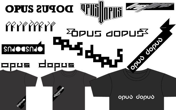
In 2007 Monorex were toying with the idea of launching a clothing line called "Opus Dopus" and wanted a (in their words) "more typographic logo" to be used alongside their more graffiti-inspired graphics and we designed a series of suggestions for them.
The design would be featured on T-shirts as well as in advertising and we played around with the placement of these one of our favourite places to slap a print is under the arm, but that only work on ring-spun (no seams in the sides) tees, so other, more conventional designs were presented.
In the end Opus Dopus never happened so a final logo was never picked and these designs will forever be in limbo. There is a good font design or two that we should to pick up and develop.