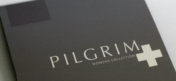
Danish jewellery company PILGRIM needed an addition to their regular logo as they were launching a series of real silver jewellery. Working with them from an early stage, the studio took part in the naming process as well as the design of the addition. PILGRIM was split between "PILGRIM MORE" and "PILGRIM PLUS" which we changed into PILGRIM+" the + was chosen over the "More" because of language, + worked in any language.
The process for this one would set the standard for logo design for later clients - for instance as we at one point or another would work on the logo sitting next to the client. This method only works if the client has a good eye for design as they're expected to make sense of unfinished work.
In addition to the reworked logo we also supplied a short manual, but in the end PILGRIM decided to let us design the brochures, stickers, merchandise and implement the logo in display cabinets which had already been designed, something we would have loved to have had a crack at.